reemarc is an early-stage digital healthcare startup and consumer mobile app that connects patients with trusted dental clinics worldwide, making high-quality care more accessible, personalized, and seamless through technology.
I led the end-to-end design of the consumer app, defining the core user experience, patient–clinic communication flows, and foundational product structure from early development through launch.
Role
Product Designer
Timeline
Sep 2025 - Mar 2026
Scope
Product Strategy, UX/UI, User Scenario, Design system
OUTCOMES
305
Monthly Active Users
121
Weekly Active Users
15
Daily Active Users
80%
Sign-up Completion
PROBLEM
Dental care systems are fragmented. Treatment records are often tied to individual clinics, and care quality varies significantly across providers. For patients, this makes it difficult to continue treatment across clinics and hard to feel confident when choosing a dentist, especially in unfamiliar or international contexts.
SOLUTION
We created a patient-centered dental care ecosystem that allows users to view, manage, and carry their treatment records more seamlessly, while connecting them with trusted dental providers across a verified clinical network. This helps patients continue care more confidently and make better-informed treatment decisions.
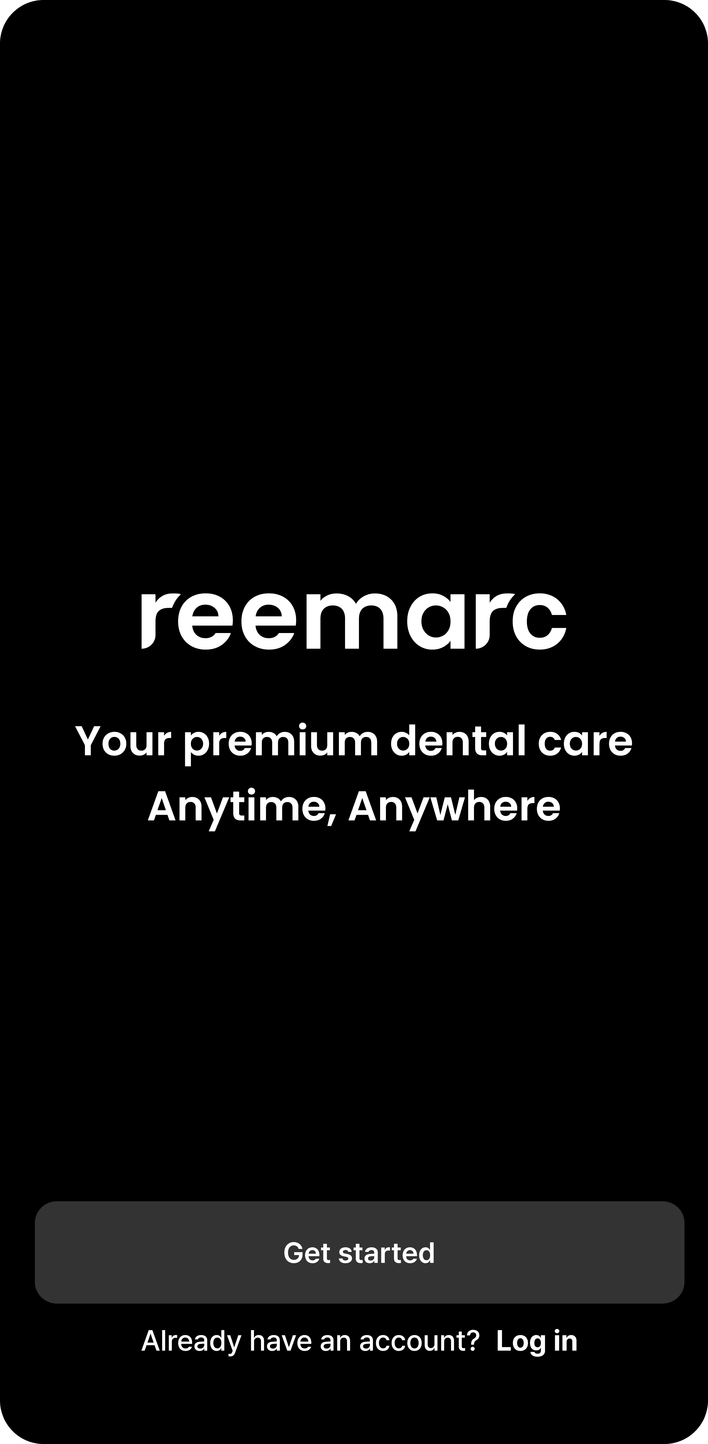
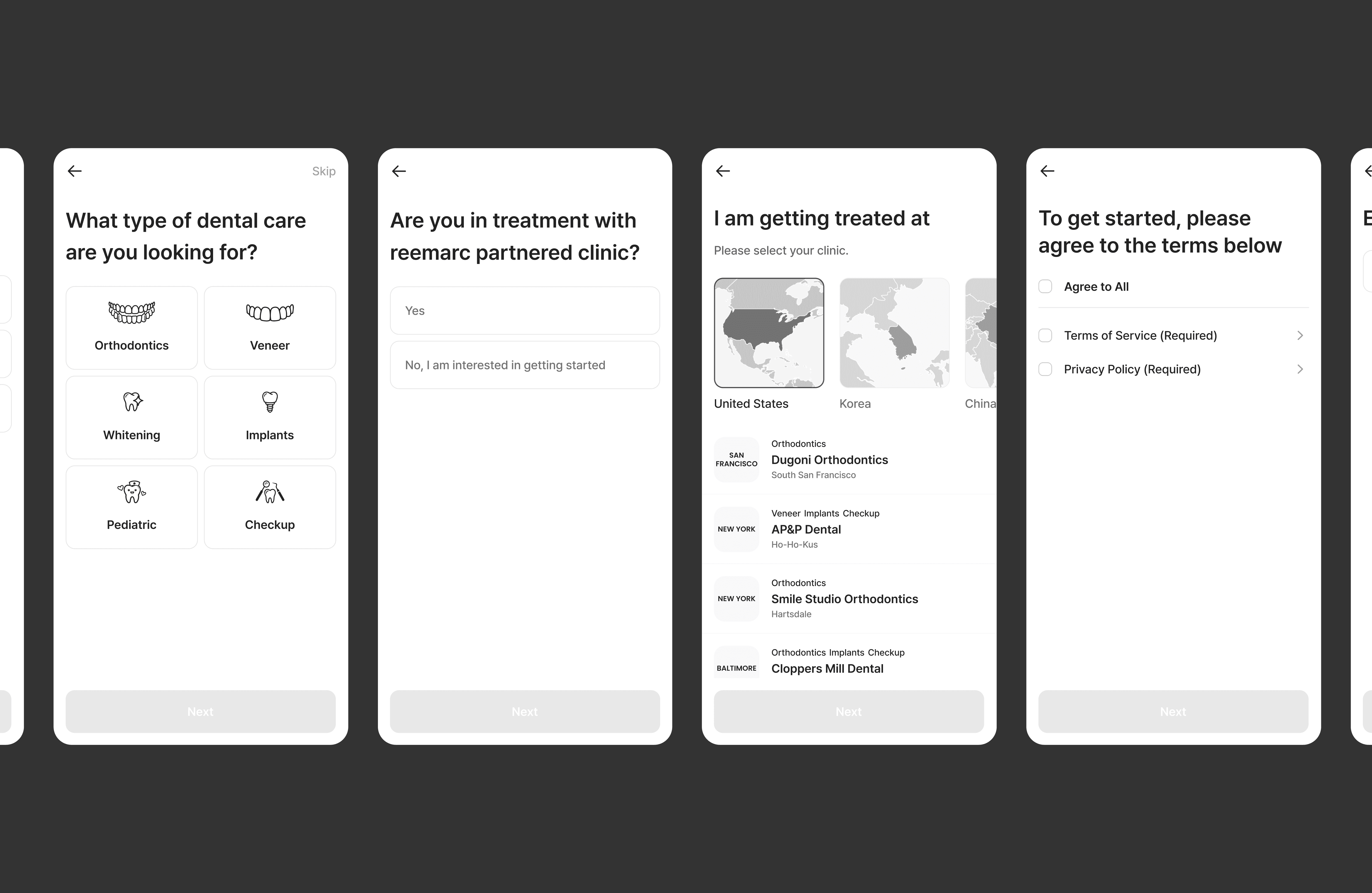
1. Establish a personalized care pathway
The onboarding flow is designed to communicate the core value of the product while guiding users into the appropriate experience from the start.
We introduced a leading question asking what type of dental care they are looking for to immediately clarify the app’s purpose and engage users early in the process.
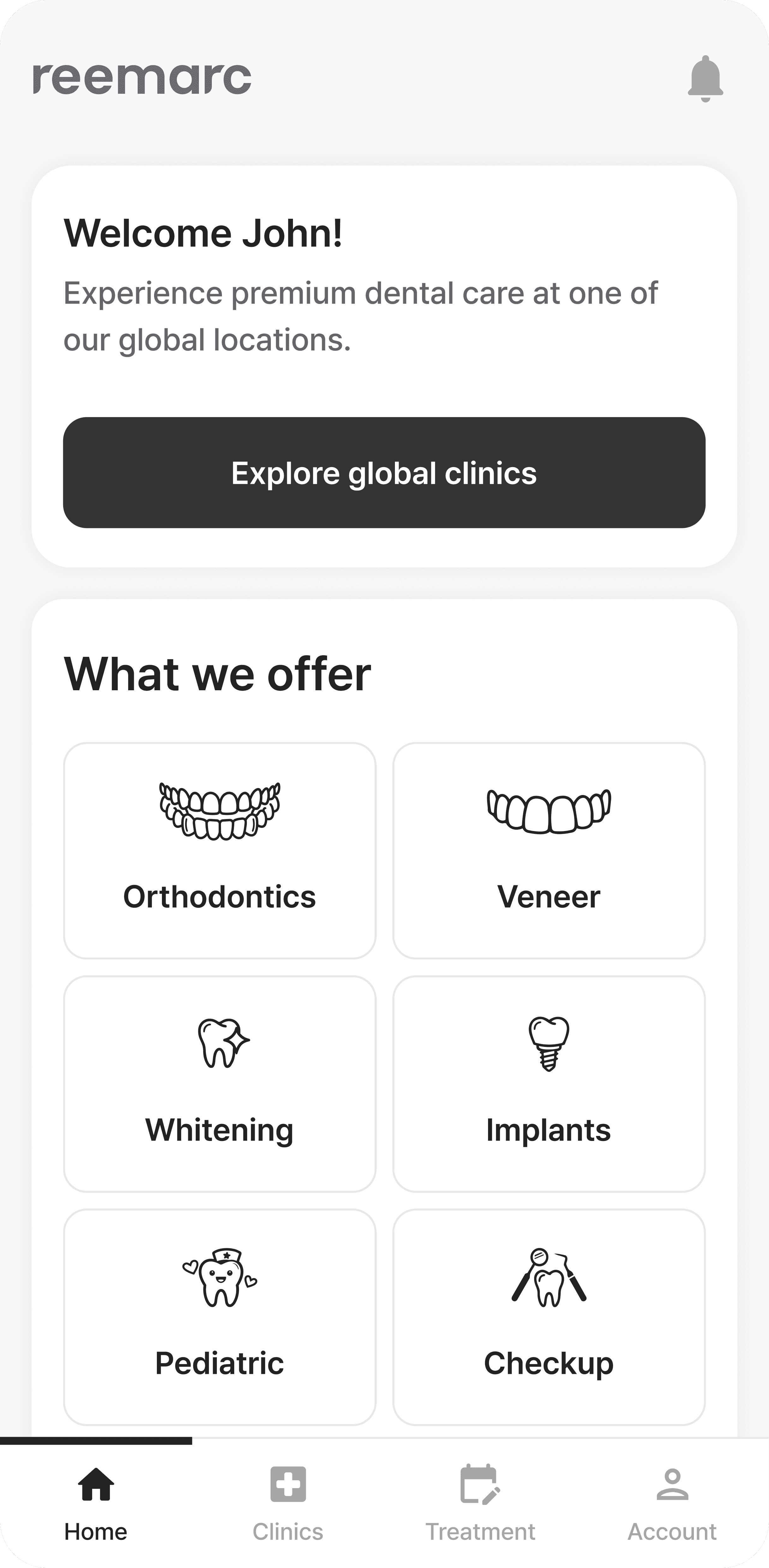
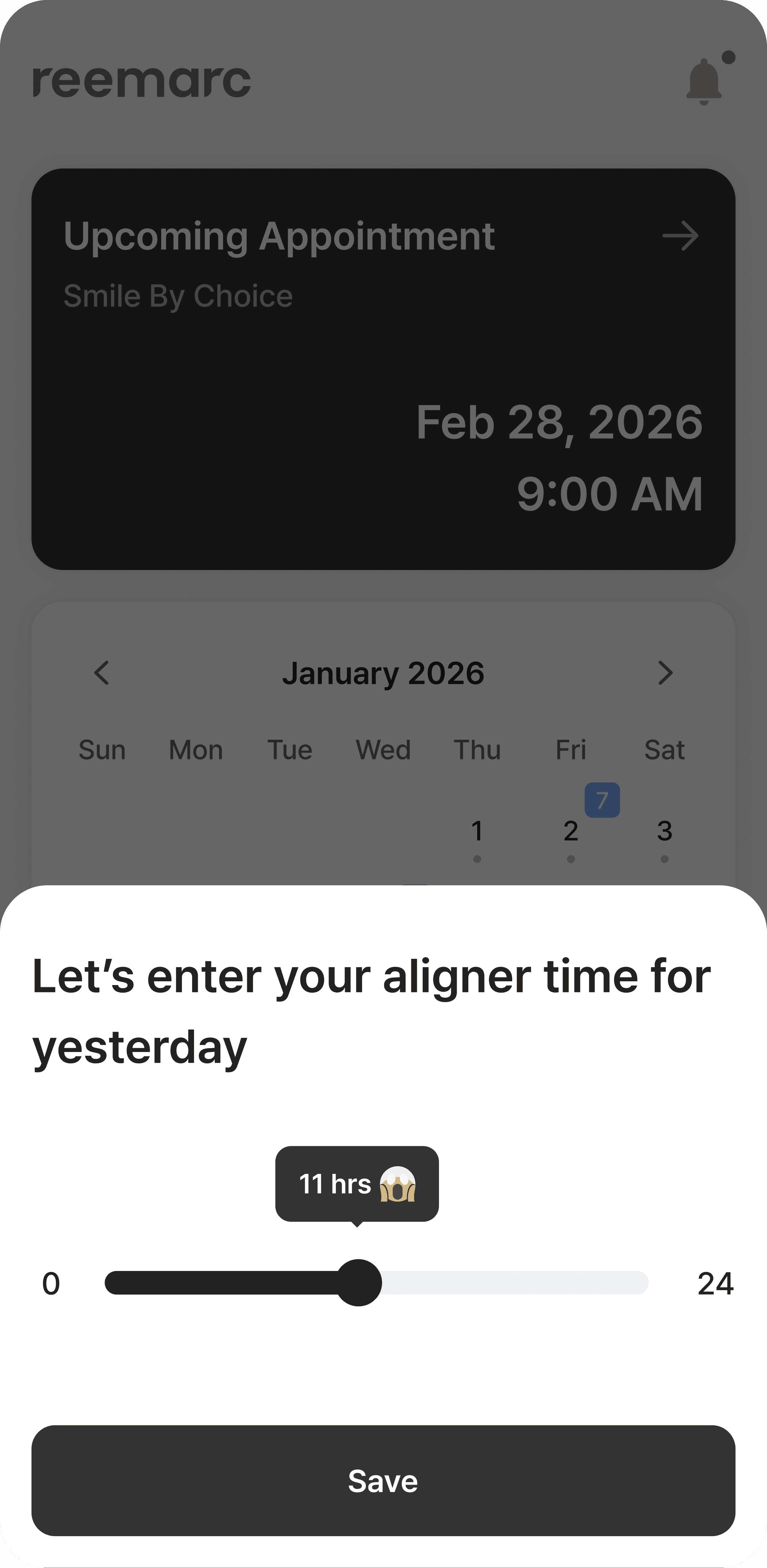
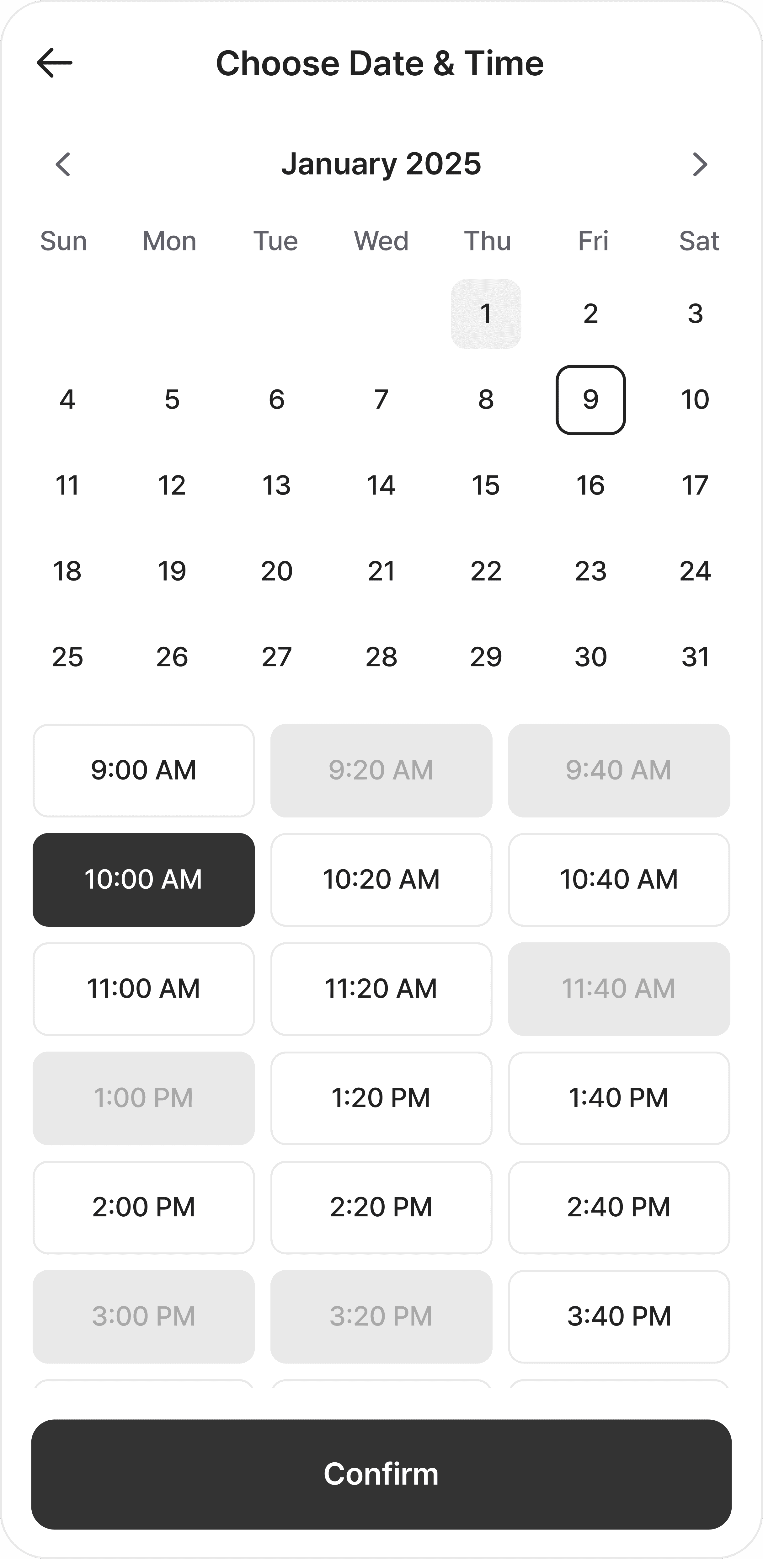
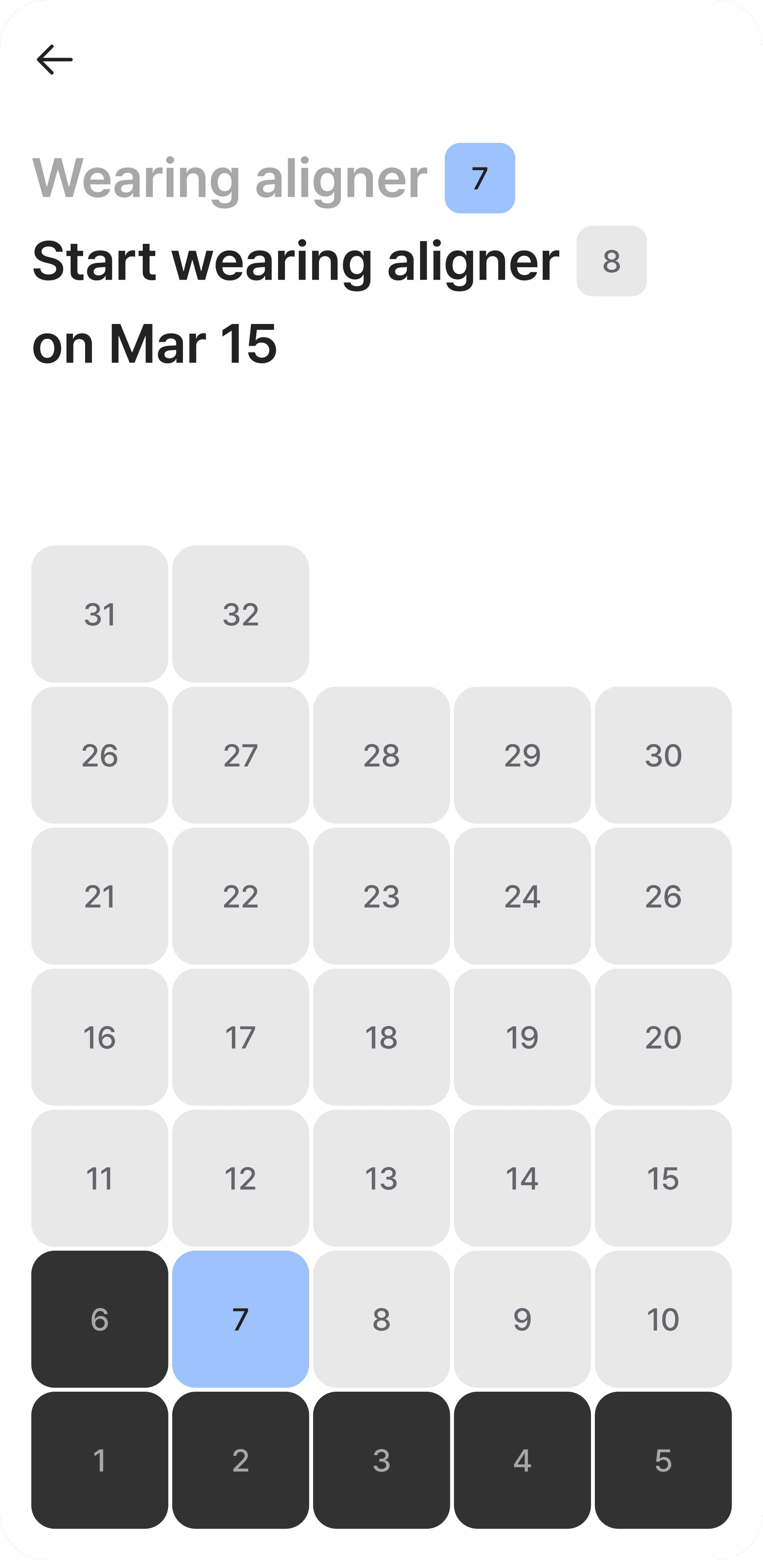
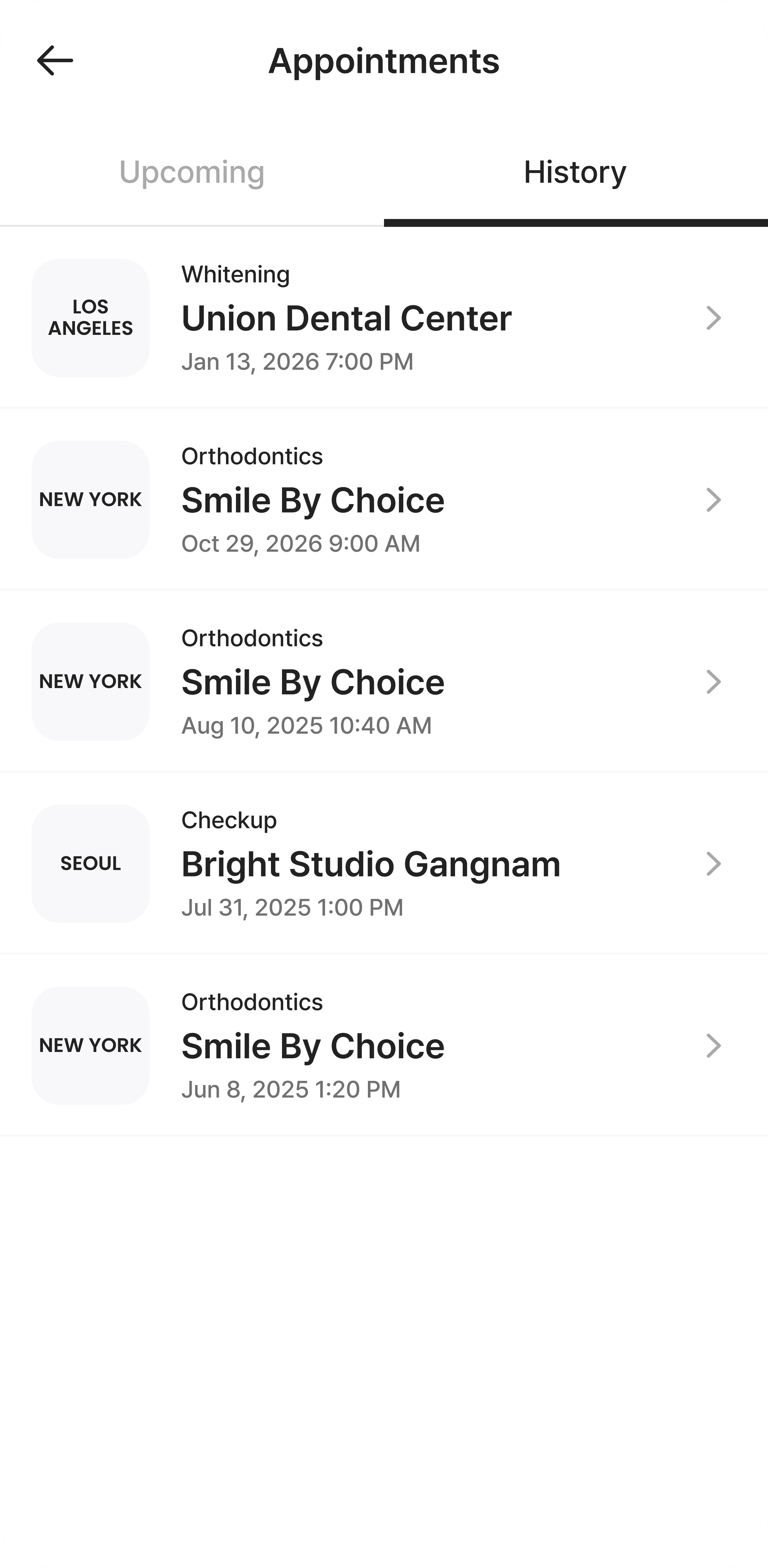
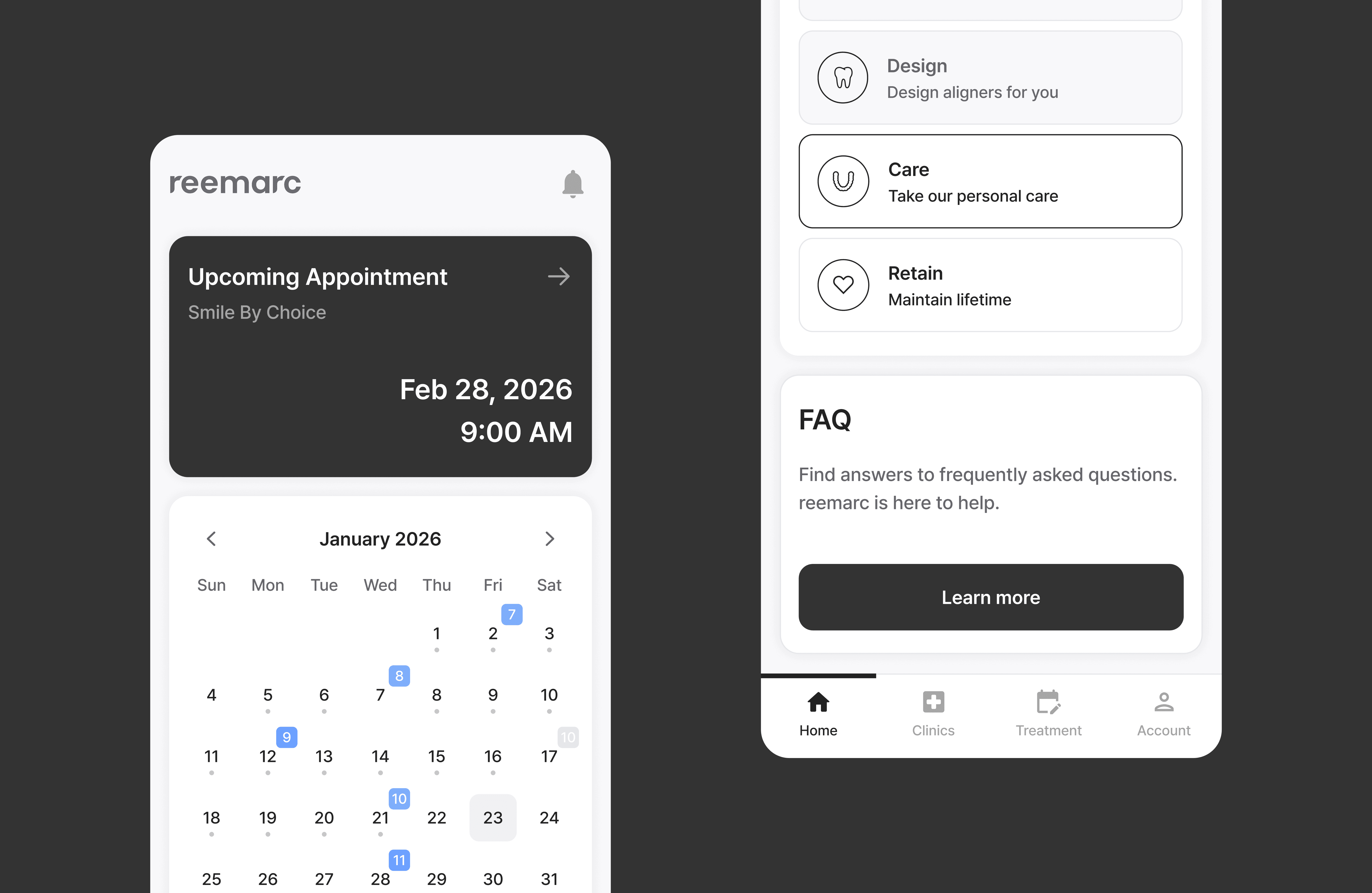
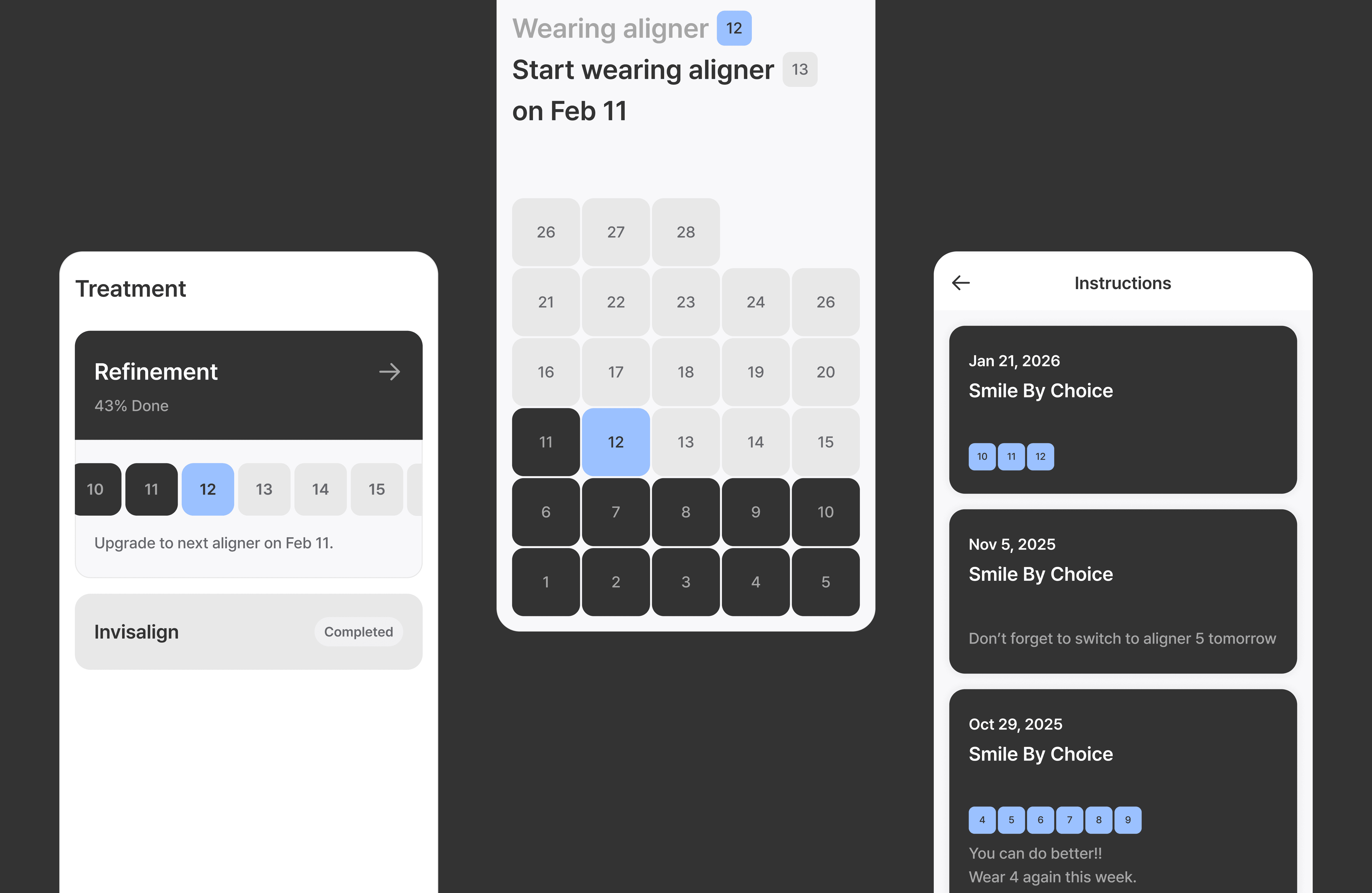
2. View your care and schedule at a glance
By surfacing time-sensitive information and reducing the need to navigate across screens, it helps users stay organized and maintain continuity throughout their care journey.
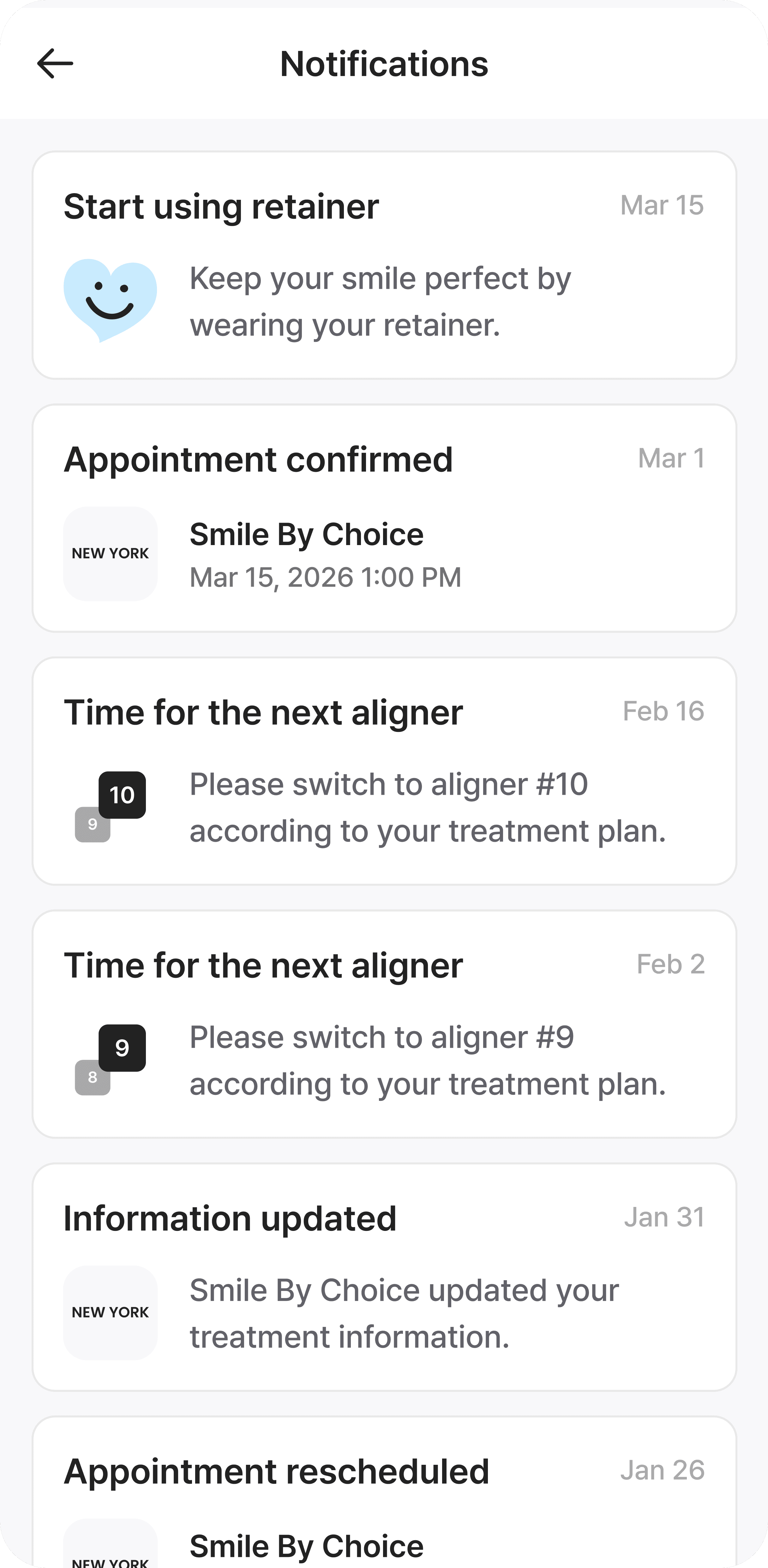
The experience is further supported by interactive elements such as a calendar that allows orthodontic patients to track wear time, along with timely notifications for appointments and treatment updates. These features help reinforce daily engagement and ensure users stay on track with their care.
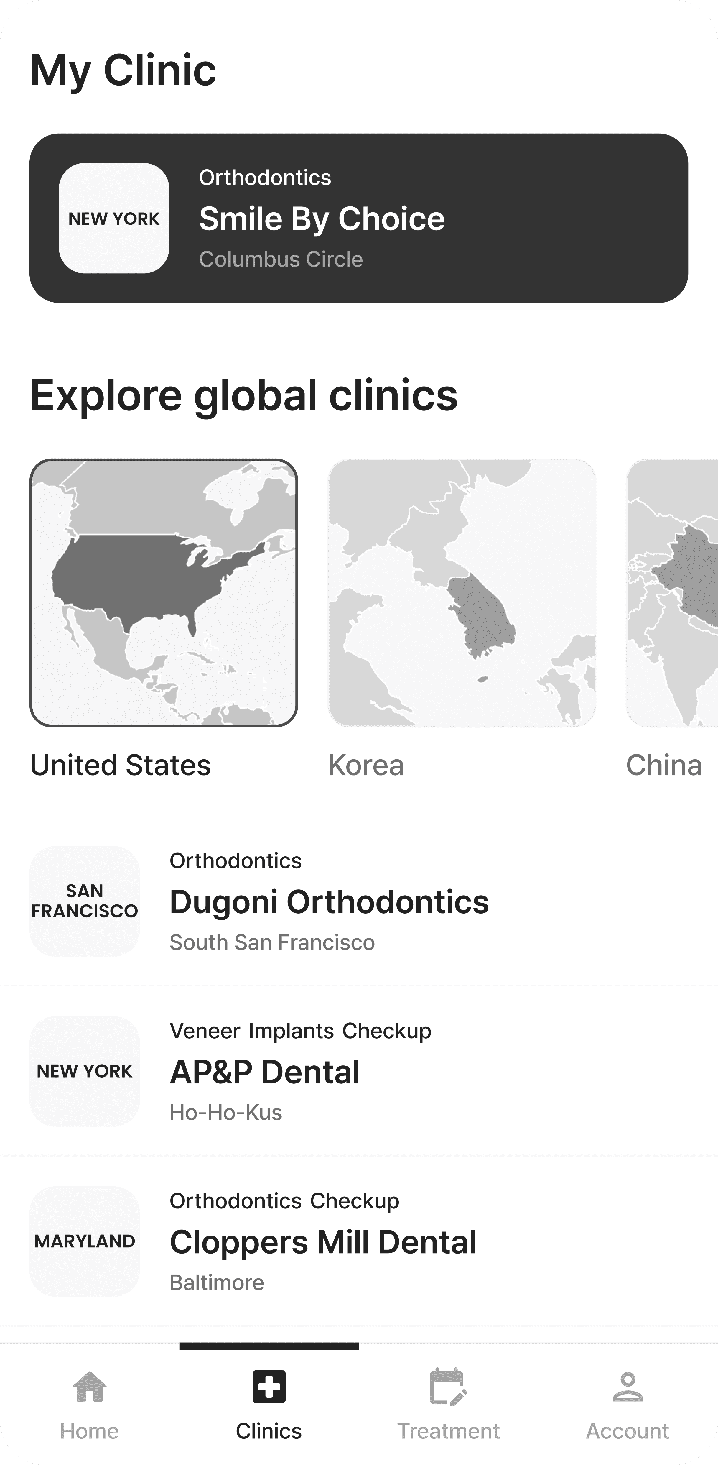
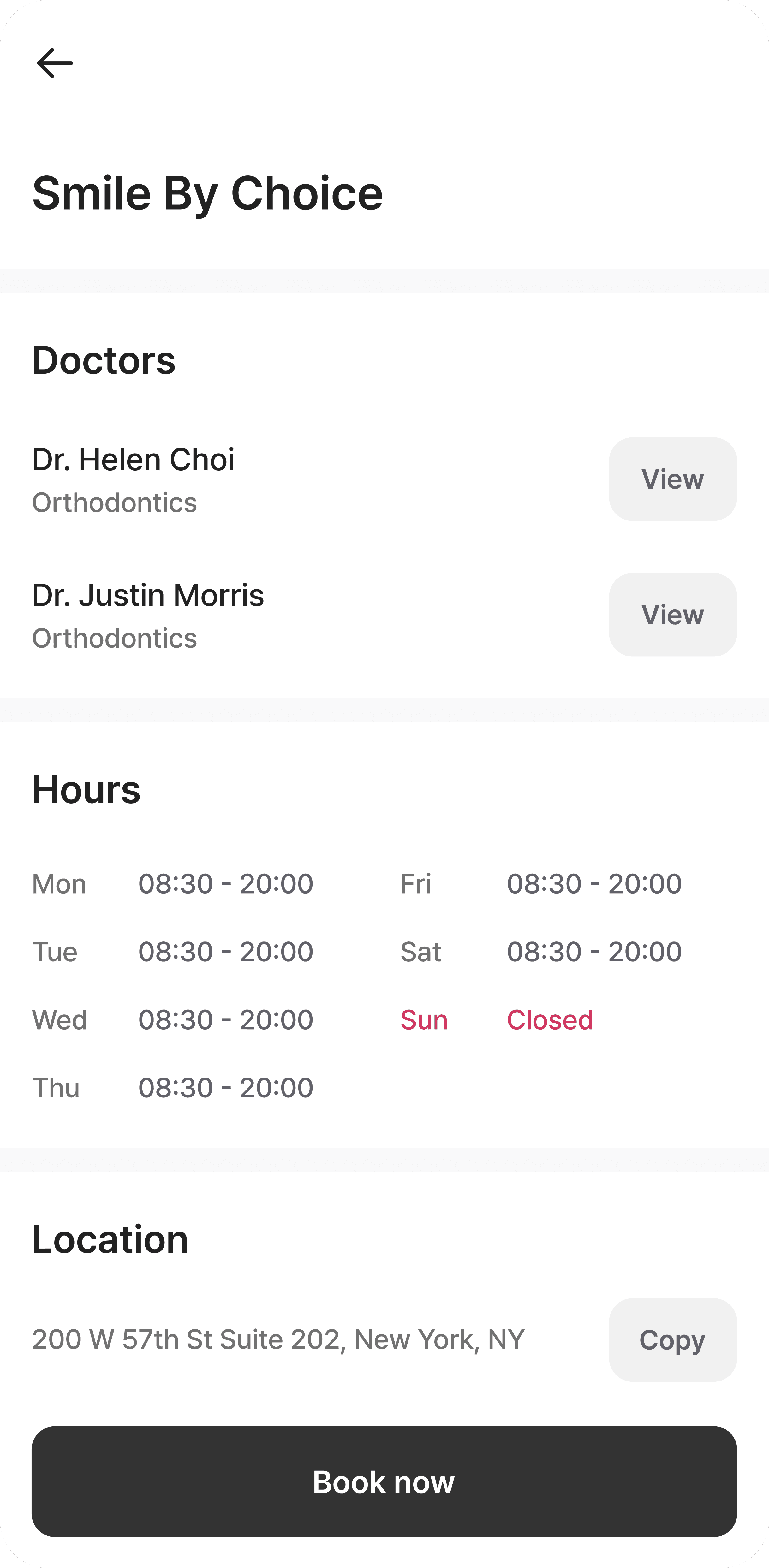
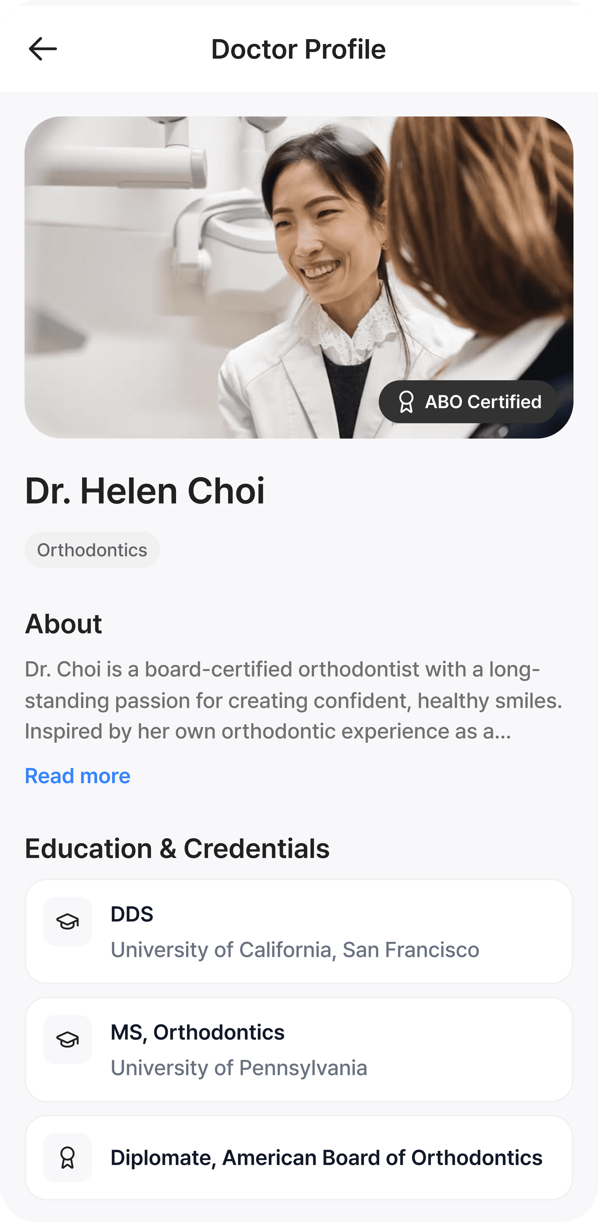
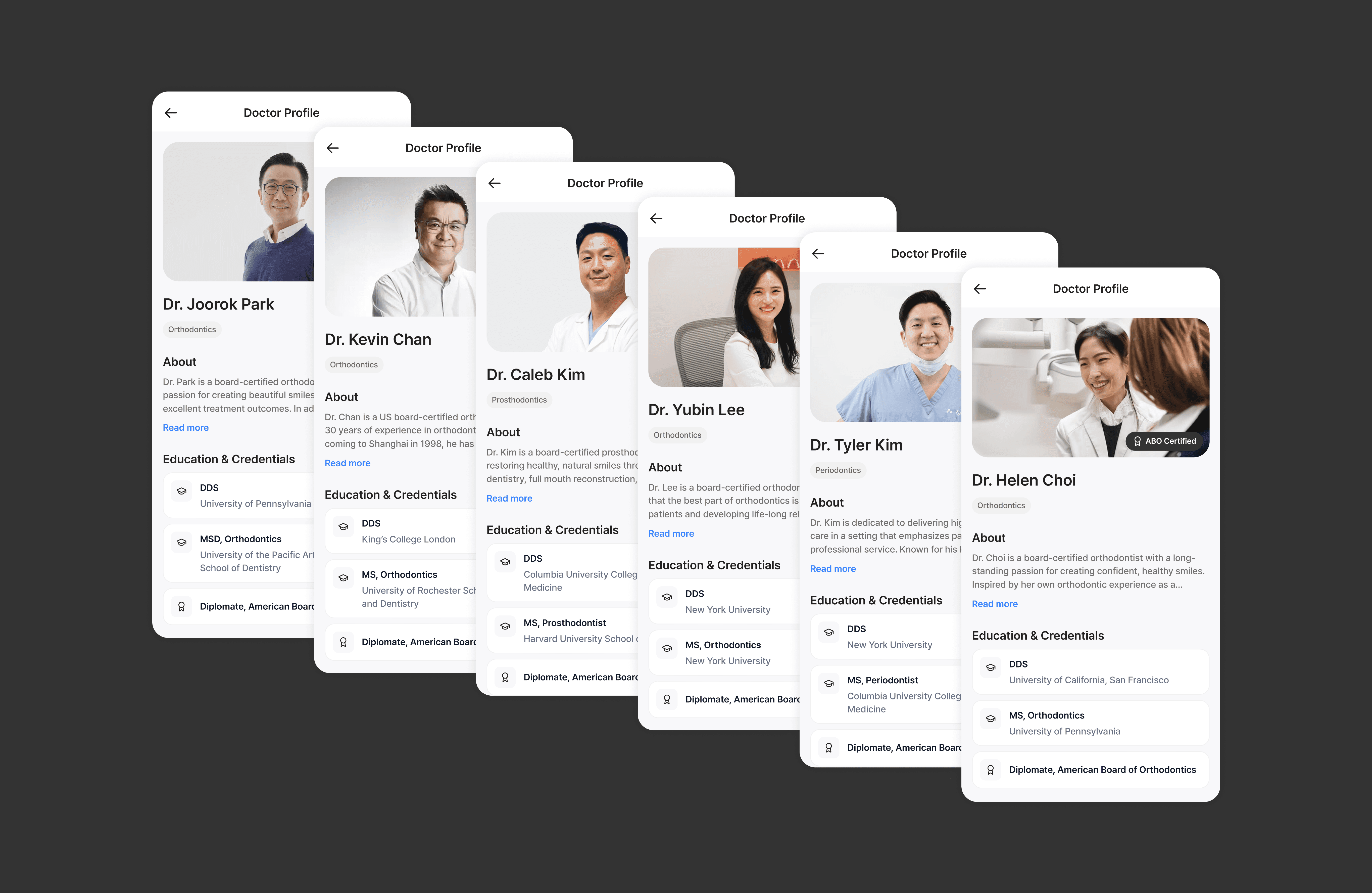
3. Explore and connect with trusted experts
The platform emphasizes a curated network of high-quality experts, surfacing verified providers alongside credentials such as board certifications (e.g., ABO, ABP) to provide clear and trustworthy signals of clinical expertise.
Finding the right dental provider can be difficult, as standards vary and information is often fragmented across sources. Users can more confidently discover and connect with providers that meet a higher standard.
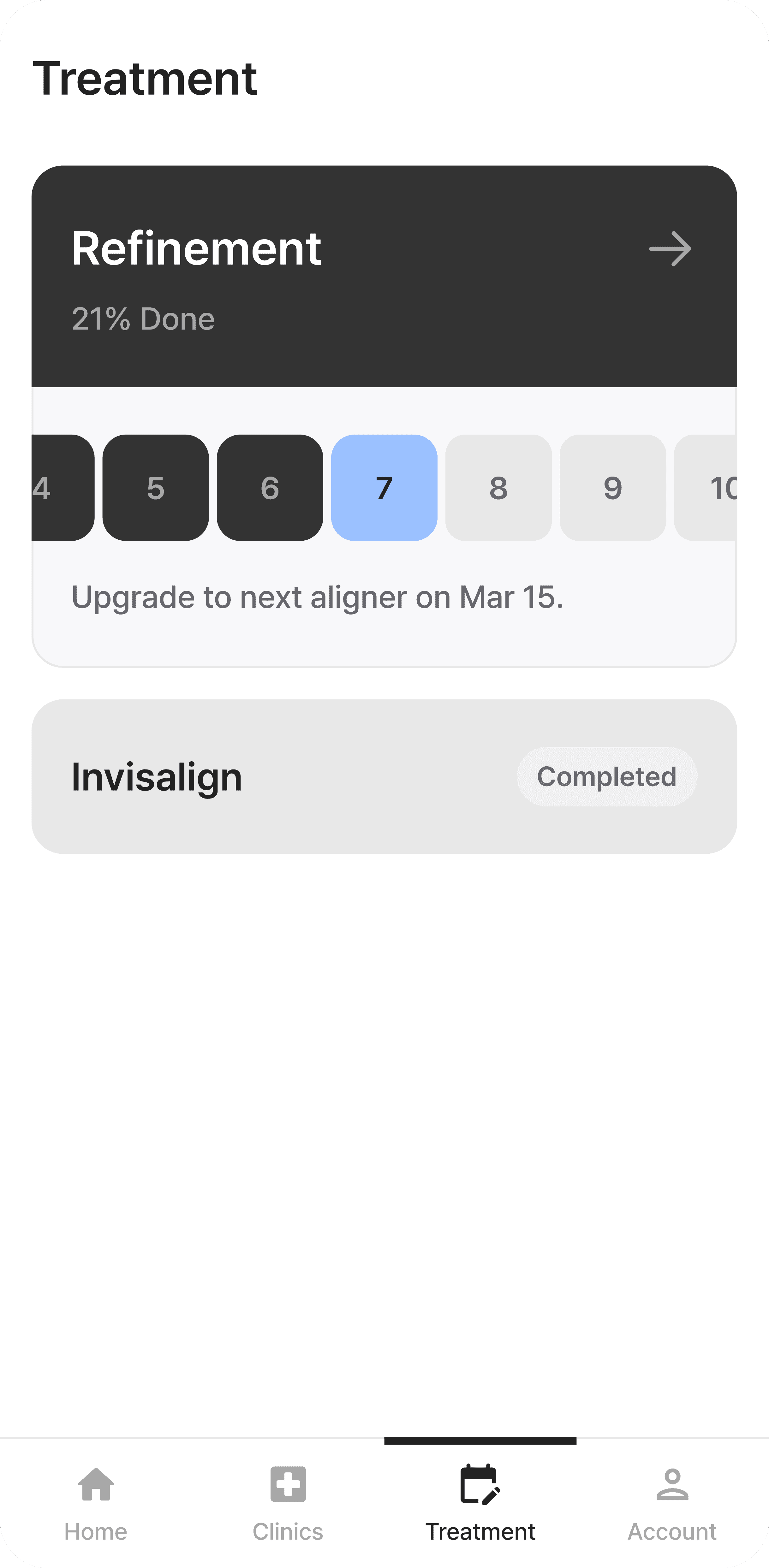
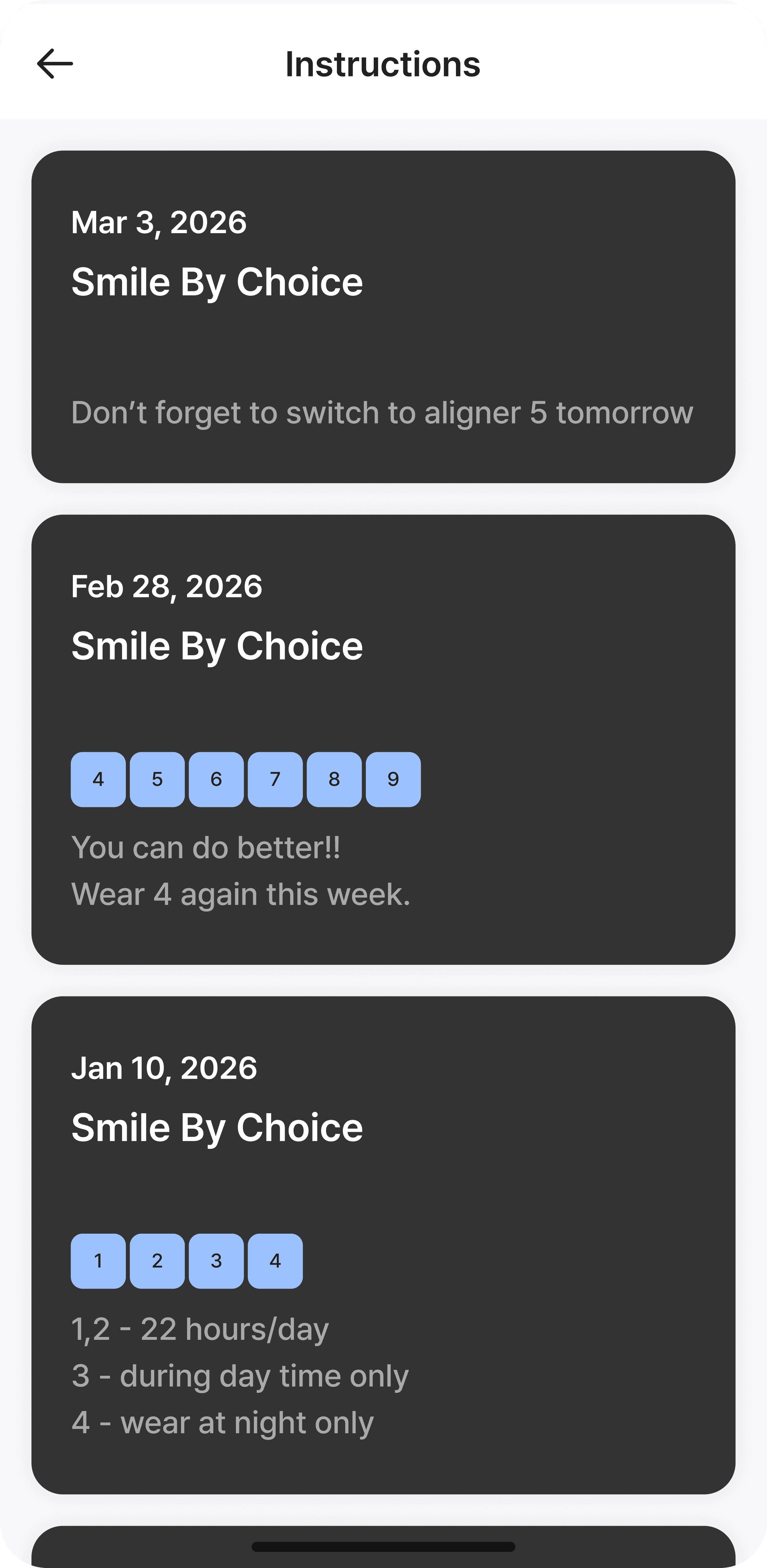
4. Organize and track your treatment
Treatment information is consolidated into a structured view that brings together different types of care and their progress over time. By organizing different treatment types and their progress in one place, it reduces fragmentation and makes it easier to track care across visits.
Users also receive notes directly from dentists that provide timely updates and guidance throughout treatment. These notifications encourage ongoing engagement and help patients stay informed and connected.
USER TESTING
After launching the initial version,I reviewed early usage patterns and user feedback to identify where the experience was breaking down in real use. While the structured system ensured reliable clinical data, it also revealed gaps in flexibility and user understanding.
Two key questions emerged from this phase:
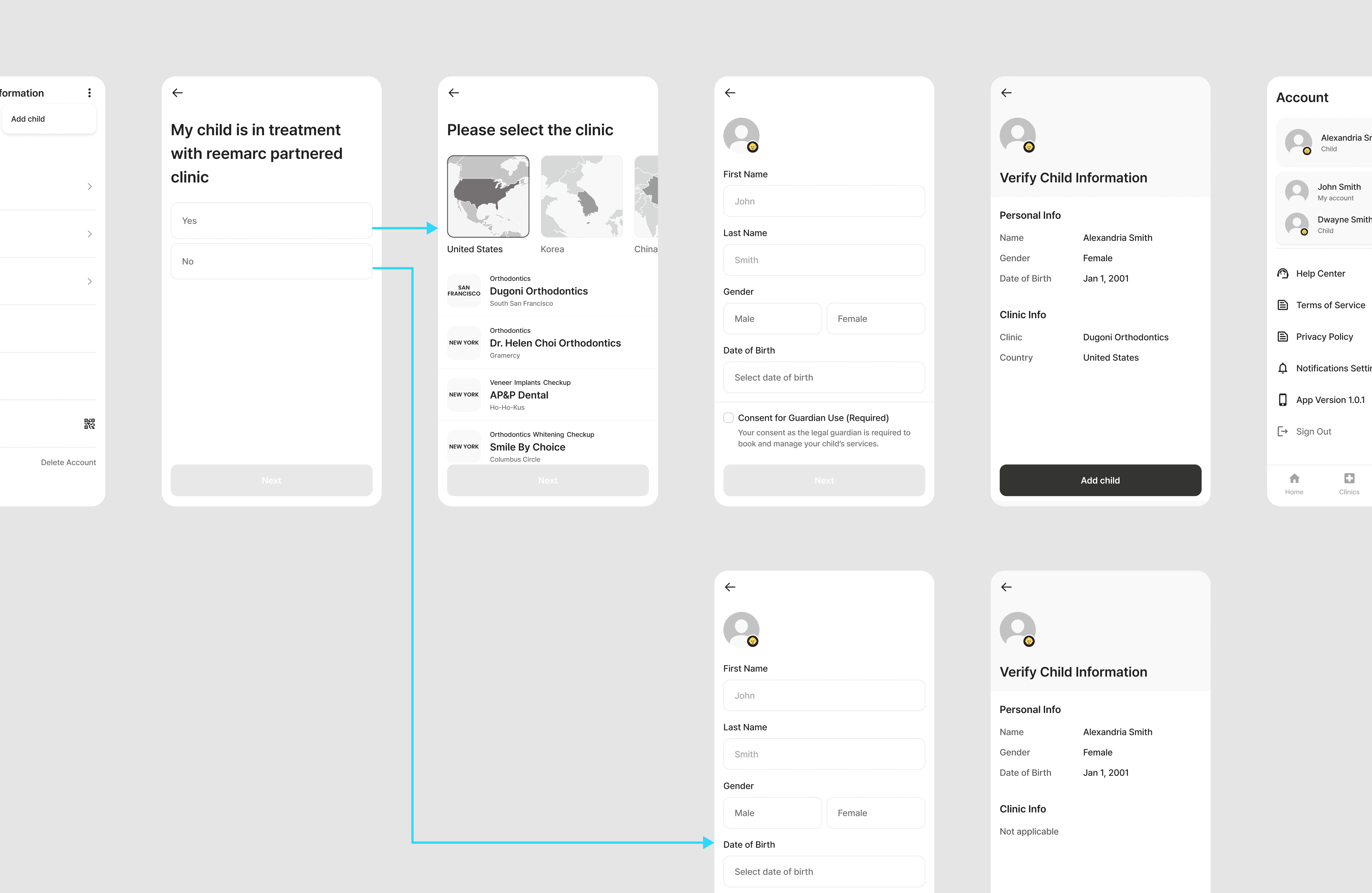
1. Can I use this for my child?
Some users were parents who wanted to manage dental care on behalf of their child, but the product initially assumed a single-user model. During onboarding, users were unsure whether to enter their own information or their child’s. This confusion continued beyond sign-up, when booking appointments or receiving notifications. As a result, users lacked confidence in how the system represented the patient, revealing a fundamental gap in how user roles and ownership were defined within the product. This showed that the issue was not just UI clarity, but the product’s underlying patient model.
2. What if my clinic isn’t part of the reemarc network?
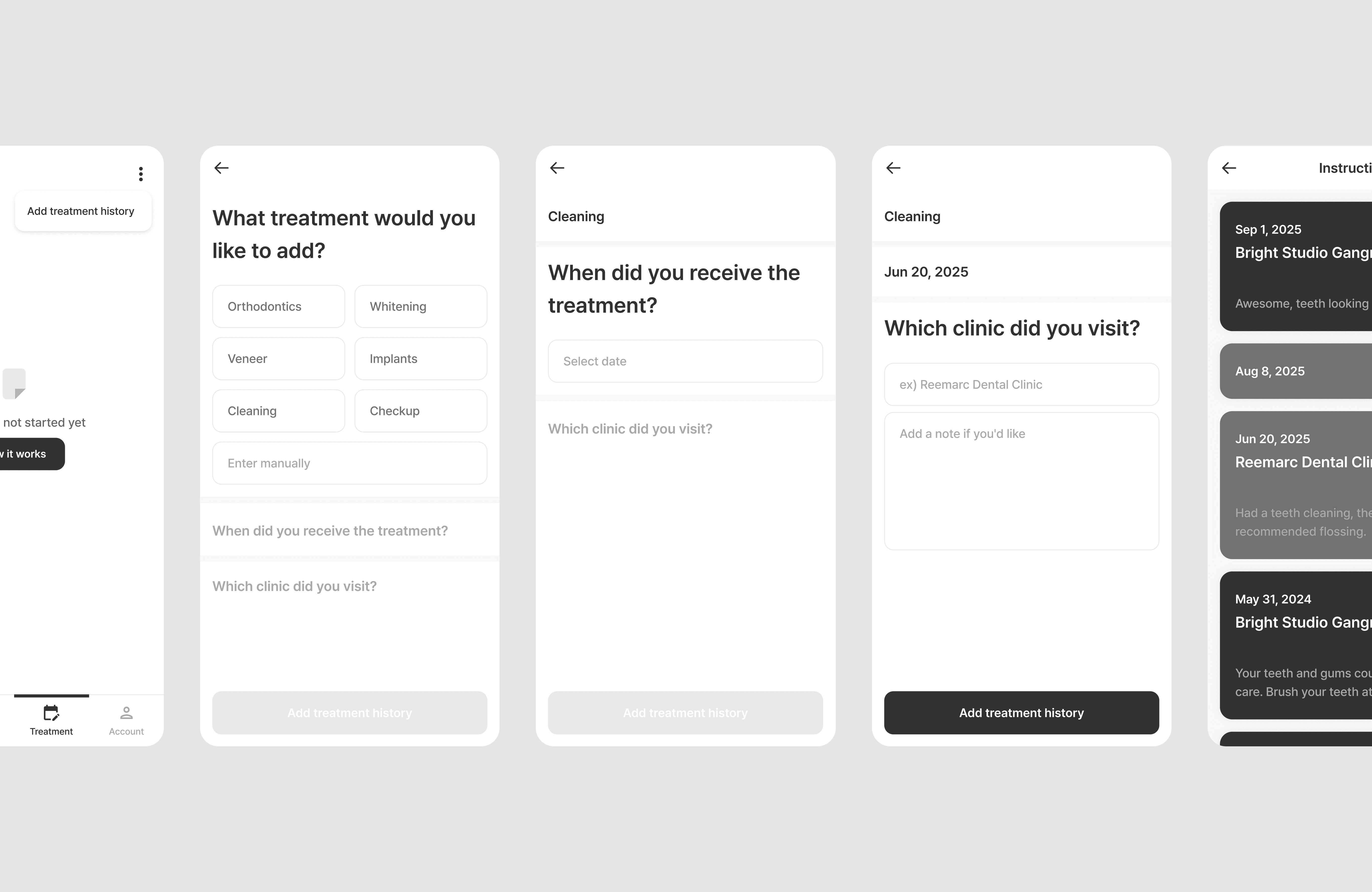
The service initially focused on a curated network of high-quality partner clinics, ensuring that all treatment data was accurate and verified by professionals. However, with only a limited number of partnered clinics available, this created a significant gap for new users, as those outside the network were left without a clear way to engage, especially within the Treatment tab. Since treatment records could only be created by dentists through the B2B system, most users were unable to use what was intended to be the core feature of the product. This revealed that the treatment experience depended too heavily on clinic participation, which limited the product’s value for many users.
ITERATION
Based on these insights, we evolved the product to better reflect real user needs and expand its usability beyond the initial constraints.
Supporting caregiver scenarios
The product assumed a single-user model, while in reality many users manage dental care for their children.
I restructured the experience to better support both self-care and caregiver use cases across the product. What initially surfaced as onboarding confusion pointed to a broader patient-ownership issue, which I addressed by introducing full profile switching so users could manage multiple patients more seamlessly.
Expanding beyond partner clinics
To reduce the product’s dependence on partner clinics, I added a manual treatment logging flow that gave users a way to build and manage their records themselves. This grants users full ownership of their dental records, transforming the app into a centralized hub for their holistic oral health journey.
This shifted the experience from a clinic-controlled system to a patient-driven record, where users can consolidate treatments across different providers in one place.
IMPACT
These iterations made the experience more flexible and better aligned with how users actually manage care. After update, the product showed strong early engagement, with 305 MAU, 121 WAU, 15 DAU, and an 80% sign-up completion rate. For me, these signals validated that the onboarding flow was clear and that users could successfully enter and engage with the core experience. At the same time, the feedback revealed that long-term value depended not just on usability, but on whether the system could support more realistic care scenarios beyond the initial service model.
TAKEAWAYS
This project taught me that designing for healthcare is not just about making complex information easy to understand. It also means building systems that reflect how care is actually experienced over time. Through reemarc, I learned how to turn service complexity into a structured, adaptable experience, and how to use post-launch feedback not just to improve screens, but to rethink the product at a system level.
Smile Solutions
->