Smile Solutions
Smile Solutions is a web portal that enables dental clinics to manage patient treatment progress and communicate with international patients throughout their care journey.
I inherited an early beta with fragmented patterns and underdeveloped workflows, then restructured the product based on user interviews and operational review to make it more consistent, usable, and ready for real clinic use.
Role
Product Designer
Timeline
Sep 2025 - Mar 2026
Scope
Product Strategy, UX/UI, User Interview, Quality Assurance
Smile Solutions deployed at iKang IDC DENTAL in Shanghai, China
OUTCOMES
3
Countries
23
Partner Clinics
6+
Treatment Offerings
RESEARCH
I approached the beta from two research angles: market context and real clinic feedback. Reviewing how existing dental SaaS tools balanced complexity and usability helped me clarify Smile Solutions’ positioning, while an in-depth interview with a partner clinic revealed where the experience still felt incomplete in practice.
Market Context
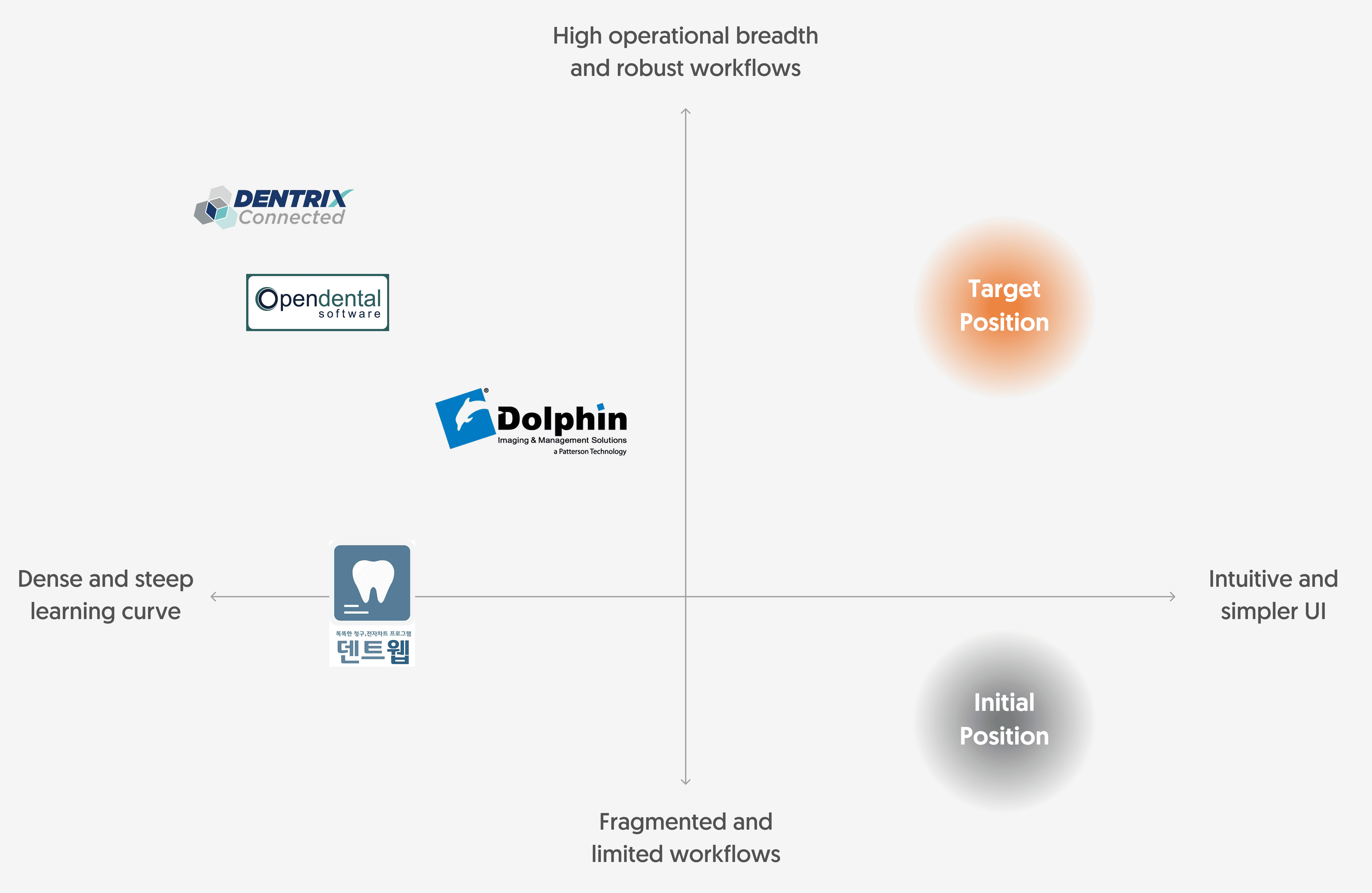
Dental SaaS tools are often feature-dense and operationally heavy. Products like Dentrix, Open Dental, and Dolphin support broad workflows, which often leads to dense interfaces.
Smile Solutions was positioned as a more focused and intuitive clinic tool. In its initial beta stage, however, this simplicity was mostly surface-level. The product’s underlying patterns were fragmented, and the core workflows weren't yet robust enough to handle the practical demands of a busy dental practice.

Dr. Yim | Seoul Clear Orthodontic Clinic
User Interview
To understand how the beta held up in real clinic settings, I conducted an in-depth interview with Dr. Yim, a partner clinic doctor. While he appreciated the product’s clean and approachable interface, especially compared with denser clinic management tools, the conversation also revealed two important gaps in the beta.
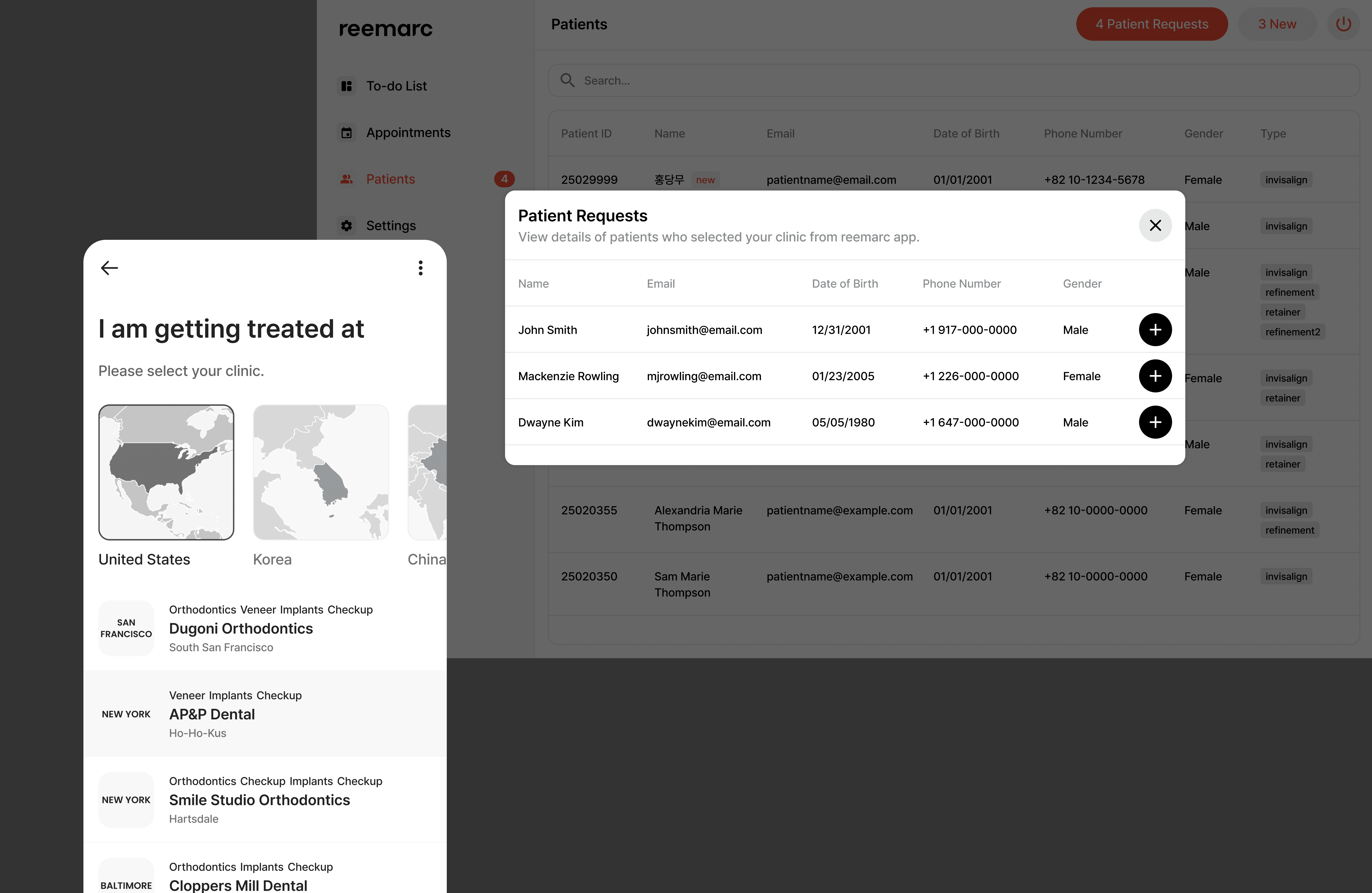
First, some clinic workflows depended too heavily on patient initiation. For example, clinics could not manually add patients from the B2B side and instead had to wait for patients to begin the process through the app. Second, although the company already had a B2C app, patient communication remained limited, with doctor notes reaching patients only at certain stages rather than supporting more continuous guidance throughout care.
Dr. Yim also suggested that the service would gain trust not simply by expanding to more clinics, but by becoming more dependable in everyday clinic practice. This made it clear that the B2B product needed to feel more operationally complete, supported by more useful patient communication through the connected app.
PROBLEM
Although the beta presented a clean and simplified interface, the interview revealed that several parts of the experience were not yet strong enough to support real adoption. Some workflows did not align naturally with existing clinic routines, the communication model did not fully reflect how clinics wanted to engage with patients, and the product’s simplified surface still lacked some of the operational structure needed to feel reliable in practice.
1. Clinic workflows depended too heavily on patient initiation
While the interface was positively received for its simplicity, some core workflows were still too dependent on the patient side. In particular, clinics could not manually add patients from the B2B product and instead had to wait for patients to begin the process through the app. This made the workflow feel incomplete from the clinic’s perspective and reduced the product’s usefulness in day-to-day operations.
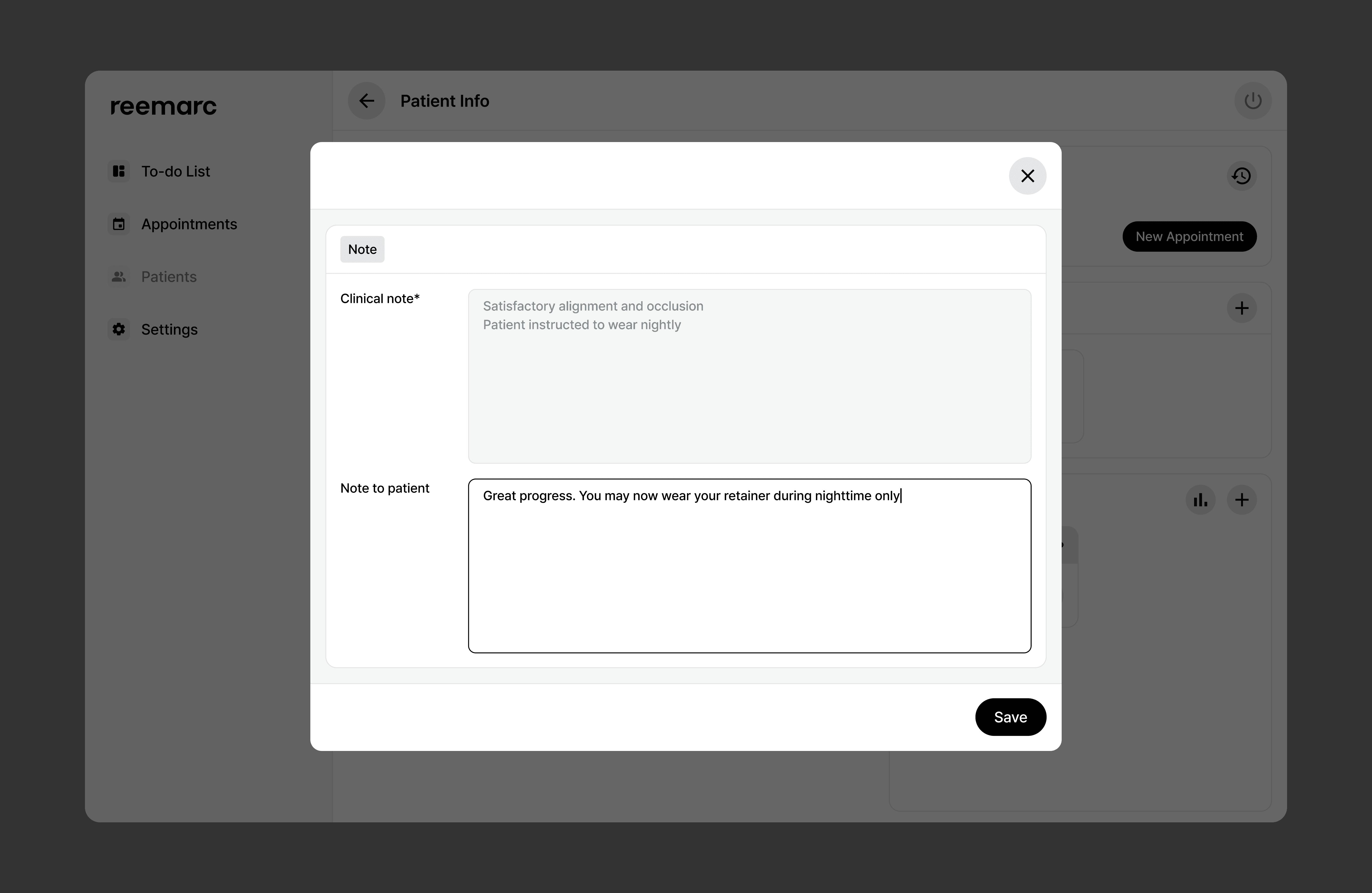
2. Patient communication was too limited to support ongoing care
The communication between clinics and patients was too limited and uneven across the care journey. Although the service already included a connected B2C app, doctor notes only reached patients at specific stages, which made guidance feel fragmented rather than continuous. This limited the product’s ability to support patient care beyond individual visits and weakened the connection between the B2B and B2C experiences.
3. The product was not yet operationally complete
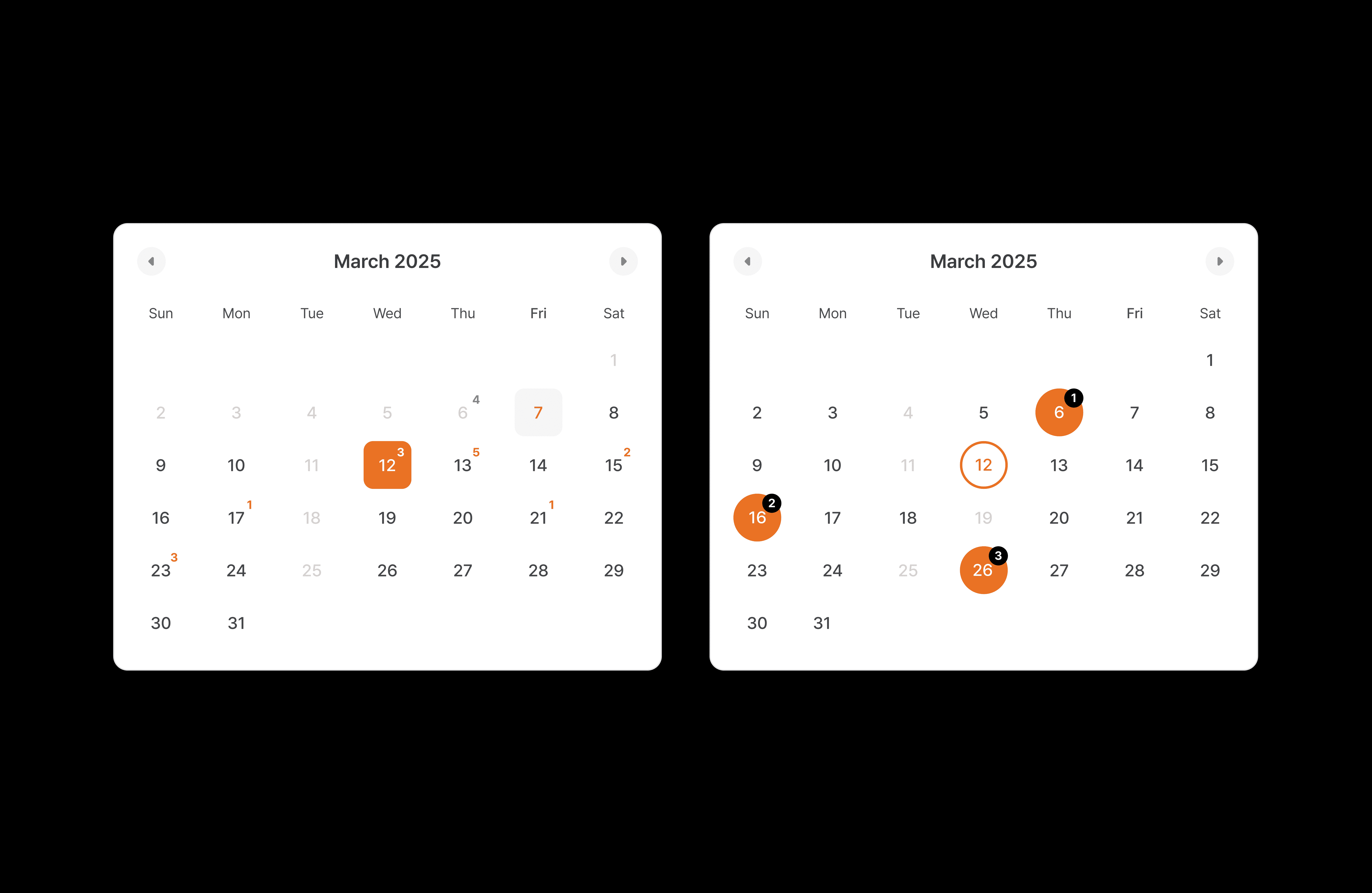
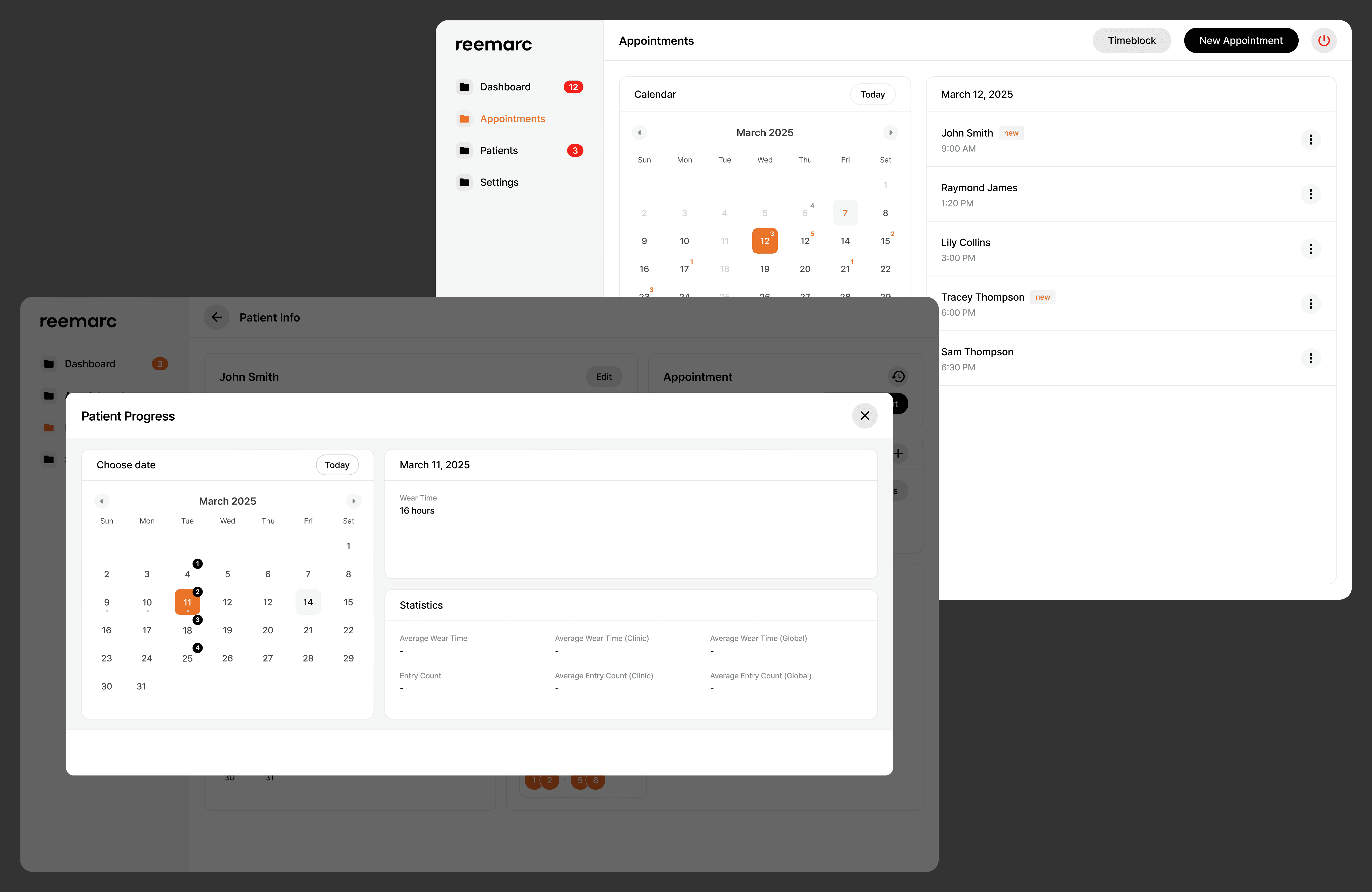
The simple interface did not always translate into clarity or completeness in use. Treatment cards had to represent multiple note states and functions, yet were not always distinguished clearly enough. In addition, the appointments experience prioritized a simplified active view but did not fully support the broader scheduling context needed by staff or more complex clinic structures such as multi-doctor environments. As a result, the product felt visually clean, but not always dependable enough for real operational use.
How might we preserve the clarity of a simple interface while strengthening
the workflow logic, consistency, and operational depth behind it?